Logos are SO 2018.
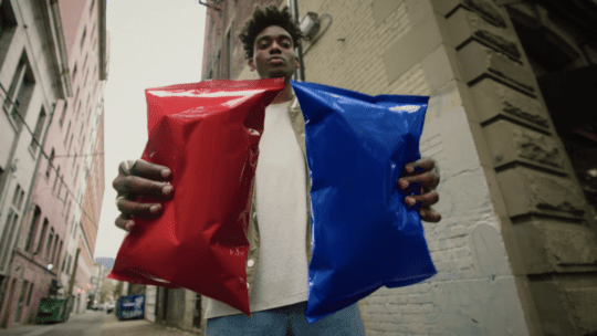
On Monday, PepsiCo Inc., the parent company of Frito-Lay’s iconic Doritos chips, launched a new advertising campaign during the MTV Video Music Awards, an annual awards show celebrating the pulse of youth culture. The campaign, titled “Another Level,” removes all logos and names from Doritos packaging, leaving behind unmarked bags of blue and red, and the archetypal triangle snack shape.
While Doritos takes a real risk in expecting consumers to recognize a brand solely on color and shape, it is not the first brand to remove naming from it’s traditional logo. Large, legacy brands like Mastercard, Nike and Starbucks have all embraced the shape-only logo trend. Doritos goes a step farther, hence, “Another Level,” in removing all watermarks of brand identification.
Brand Confidence From Research
Every brand has its reasonings for altering a known commercial presence. Mastercard introduced its modern design in early 2019 to “mark better across digital media.” Starbucks wanted to expand its products outside of their own cafes and coffee. Nike was one of the first companies to jump on the de-branding trend in 1995, allowing for a less-corporate and ultimately even more recognizable brand.
But these decisions definitely do not happen without extensive consumer research. Raja Rajamannar, chief marketing and communications officer at Mastercard, told The Drum that research proved “more than 80 percent of people” could recognize the symbol without the actual brand name.
Before a brand thinks of itself as world-renowned, it needs to take the necessary steps to determine public opinion and recognition. We can safely say that Doritos appear in most corner stores, on coffee tables during sporting events, and in lunch bags across the globe.
Actionable Advertising
Gen Z grew up on advertising-free content, through almost every platform. Looking at YouTube, Instagram, Twitter, Snapchat—most platforms only enabled noticeable advertising within the past few years.
With this campaign, Doritos acknowledged that Gen Z is more likely to tune out blatant corporate messaging. That’s why the ubiquitous orange chip decided to come up with something more engaging to appeal to even the most ad-averse consumer.
“There’s a desire to almost reject traditional advertising," Rachel Ferdinando, senior vice president of marketing at Frito-Lay, told The Wall Street Journal. "The real thrust of the campaign is in digital. We have a lot of content that’s focused where Gen Z consumes media.”
Doritos will encourage followers to share user generated content convening with the brand-less campaign on social media, including a triangle-themed Snapchat filter. And Doritos fans can take earn a spot on its Instagram account, when tagging creative work with #LogoGoesHere.
Will it Work?
Could this possible create a bad look for Doritos? Does the brand embrace too much ego or pride to think it can continue sales with such a drastic brand overhaul?
Doritos confirmed the de-brand is not permanent. But it will certainly be interesting to see how fans do or don’t react to a faceless product. The snack does provide clues in its advertising, communicating to consumers the simple characteristics they need to continue to enjoy Doritos, including the infamous orange fingers, in a campaign that is anything but traditional.